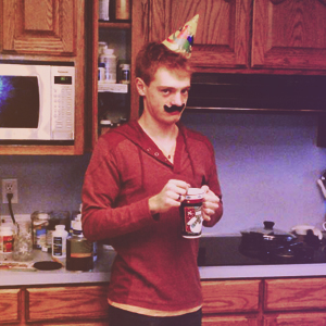
I unfortunately don't have access to my stuff over at the school right now. I'll get my recent stuff up soon.
In the mean time, here's me!
Sunday, March 31, 2013
Texture Helmet
I did this forever ago. It's just a freehand sketch of a crazy helmet. I was experimenting with texture and stuff.
Reflex Movie Poster
The final project for the photoshop section in my Digital Media class. It's a fake advertisement for a longboarding indie movie. Not the greatest, but my teacher ended up printing it and hanging the full-sized poster up in the school next to the lunchroom. He did so with a few others too.
 |
Paint Fight Poster
Another assignment for Digital Media. I was messing around with brushes I had downloaded from the internet. I unfortunately made a really stupid mistake and misspelled "View."
Beautiful Urithane
Just a fun project using Adobe Illustrator I did a year ago.
I started out with a picture I found on the internet. I wanted an attractive female longboarder.
The girl on the right was pretty close to what I wanteded.
I photoshopped her face a little, cropped, and then greyscaled.
Then I posterized her face using too many layers.
I then thresholded the photo six times, using a different threshold amount each time. I did this so I could get six layers, each representing the different levels of light intensity. I only used four of the six though so it wouldn't take so long to finish the project.
I used the images above to make four layers of shapes. I layered the shapes, and then added a final super light color as a fifth layer to finish. Added type.
Mr. Rabbit's Big Adventure
This is the evolution of a little drawing I did in French class a good year ago.
So this is just the original sketch.
This is the sketch after I had traced over it in Sketchbook Pro. Only the rabbit it somewhat done.
This is the finished rabbit with wings and arsenal.
I then decided to add a background. I still stuck with a very dark and monochromatic color palate. I added some reds and oranges to the wings though, making them more dynamic. I also darkened the shadows of the rabbit, adding some extra contrast. I also ended up cropping the picture (a poor decision because I forgot to save a version with legs still in tact. I later missed the look of a whole rabbit).
I changed the background to a much more vibrant mix of colors. I was experimenting with bright colors and such because I desired to develop a colorful style in my work, but I was nervous for some reason. It ended up working out alright.
At the time, I was also pretty excited about a new longboard shop that opened in Salt Lake City called Epic Boardshop. I now realize that the shop really isn't that great, but I really liked them then. I liked them so much, that I put their logo into the picture, using a feeling of extra depth with the type to make things more interesting.
I decided to increase the saturation and take out the type. I like the brighter colors.
This is a slightly less saturated version of the one before. I also added the logo of the local longboarding club just for fun, along with a crop.
Saturday, March 30, 2013
So I decided to make a blog. Yup! It'll be my own little secure Pintrest in art and graphic design. I initailly got the idea from this other blog while I was browsing graphic design tips. Creating a blog wasn't one of the tips, but I figure it would be a great place to keep all of my things.
Subscribe to:
Comments (Atom)


